Plotly
Plotly (Belly Button Biodiversity Dashboard)
Overview of Project
Roza has a partially completed dashboard that she needs to finish. She has a completed panel for demographic information and now needs to visualize the bacterial data for each volunteer. Specifically, her volunteers should be able to identify the top 10 bacterial species in their belly buttons. That way, if Improbable Beef identifies a species as a candidate to manufacture synthetic beef, Roza’s volunteers will be able to identify whether that species is found in their navel.
- Deliverable 1: Create a Horizontal Bar Chart
- Deliverable 2: Create a Bubble Chart
- Deliverable 3: Create a Gauge Chart
- Deliverable 4: Customize the Dashboard
- Deliverable 5: A written report on the Belly Button Biodiversity Dashboard analysis
README.md.
Functional JavaScript
The map() Method
The map() method in JavaScript applies a transformation to each element in an array. Like a for loop, it can perform an operation to every element of an array.
Here is an example in which all the numbers of an array are doubled:
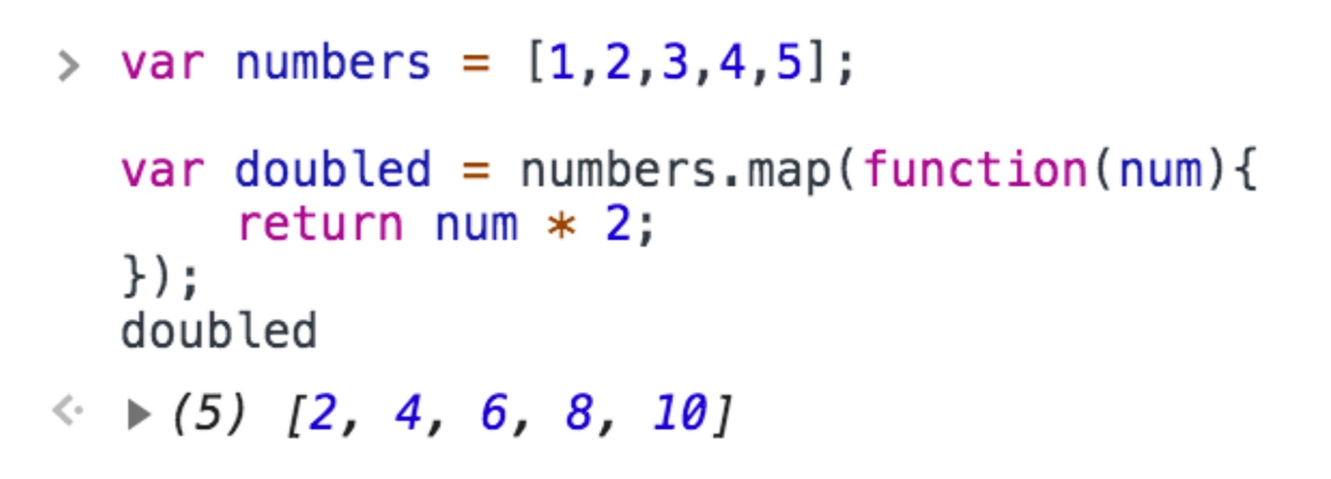
var numbers = [1,2,3,4,5];
var doubled = numbers.map(function(num){
    return num * 2;
});
console.log(doubled);
In this code, an array named numbers contains five integers:var numbers = [1,2,3,4,5];. Let’s break down the rest of the code in more detail:
- The
numbersarray calls themap()method. - Inside the
map()method, there is another function. This function is anonymous, meaning that the function does not have a name. Whenmap()is called, it in turn calls this anonymous function. - The anonymous function takes a parameter, named
num, and returns the number multiplied by 2. Its sole task is to perform this single action. - For every element in the array, the
map()method calls the anonymous function, which doubles the value of the element. - The
map()method returns an array of doubled values, which is assigned the variabledoubled.
Here, the map() function becomes a method of the numbers array. It then takes in an anonymous function whose sole task is to double the value of num, its argument.
Behind the scenes, an iterative process similar to a for loop takes place. The anonymous function takes in each integer of the numbers array and doubles it. Finally, the variable doubled is an array of integers whose values are twice their original values.
Try running the code in your browser console and view the results for doubled. You should see the following:
The filter() Method
Another functional programming technique is the filter() method. Like the map() method, it accepts another function as its parameter. Like map(), filter() performs an operation on every element in the original array. Unlike map(), however, filter() does not necessarily return an array whose length is the same as the original array.
Let’s see what this means in an example. Run the following code in your console. What does larger return?
var numbers = [1,2,3,4,5];

var larger = numbers.filter(function(num){
    return num > 1;
});

console.log(larger);
It returns an array of integers that are larger than 1: [2,3,4,5].This example is remarkably similar to the last one, with one major difference.
First, the similarities:
- The
numbersarray uses thefilter()method. - The
filter()method, in turn, takes an anonymous function as its argument. The anonymous function’s sole task is to take in a parameter, callednum.
The filter() method operates on each element of the numbers array. So how does it differ from map()?
The map() method transforms every element of the original array, and so the size of the transformed array is the same as that of the original array.
The filter() method, on the other hand, returns an array of values that meet certain criteria. Values in the original array that do not fulfill the condition are filtered out. In this case, specifically, the anonymous function called by filter() returns true if an argument is larger than 1, and false if it does not. The filter() method runs the anonymous function on every element of the original numbers array. Only numbers that are larger than 1 are returned: [2,3,4,5]. So whereas applying map() to the numbers array would have returned an array with five elements, applying this specific filter returned an array of only four elements.
The Arrow Functions
Let’s do a quick review of arrow functions. An arrow function in JavaScript is syntactic sugar. That is, an arrow function does the same thing as a standard JavaScript function, but it streamlines the syntax used to accomplish the same task.
The anonymous function inside map() and filter() can be simplified as an arrow function. Here’s an example:
var numbers = [1,2,3,4,5];


var doubled = numbers.map(num => num * 2);
console.log(doubled);
The map() method performs the identical operation as before: it doubles each element in the numbers array. However, the anonymous function inside map() has been replaced by an arrow function. Contrast the two:
var familyAge = [3,2,39,37,9];
var sortedAge = familyAge.sort((a,b) => a - b);
console.log(sortedAge);
sortedAge returns the array [2,3,9,37,39]. Like map() and filter(), sort() takes in an anonymous function. During each iteration, the anonymous function, an arrow function in this case, compares one element of the array (a) with another element in the array (b). From a, it subtracts b. If the result is negative (i.e., b is larger than a) then it stays put. If the result of the subtraction is positive, the order of the two elements is reversed. Look at a modified version of this example.
The slice() Method
Roza also needs to be able to select a subset of the data. In her project, for example, she might perform a transformation on an array, filter it, sort it, and then display only the top five results.
var integers = [0,1,2,3,4,5];
var slice1 = integers.slice(0,2);
In this example, the slice() method returns the first two elements of the integer array: [0,1]. The first argument is the position of where to begin the selection. Here, it is at index position 0. The next argument, 2, denotes the position of the array where the slicing ceases. In other words, the slice() method begins selecting the array at index position 0, and stops right before reaching index position 2. So here, it returns elements at index positions 0 and 1, but not 2.
Let’s move on!
Deliverable 1:
Create a Horizontal Bar Chart
Deliverable Requirements:
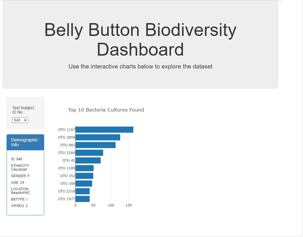
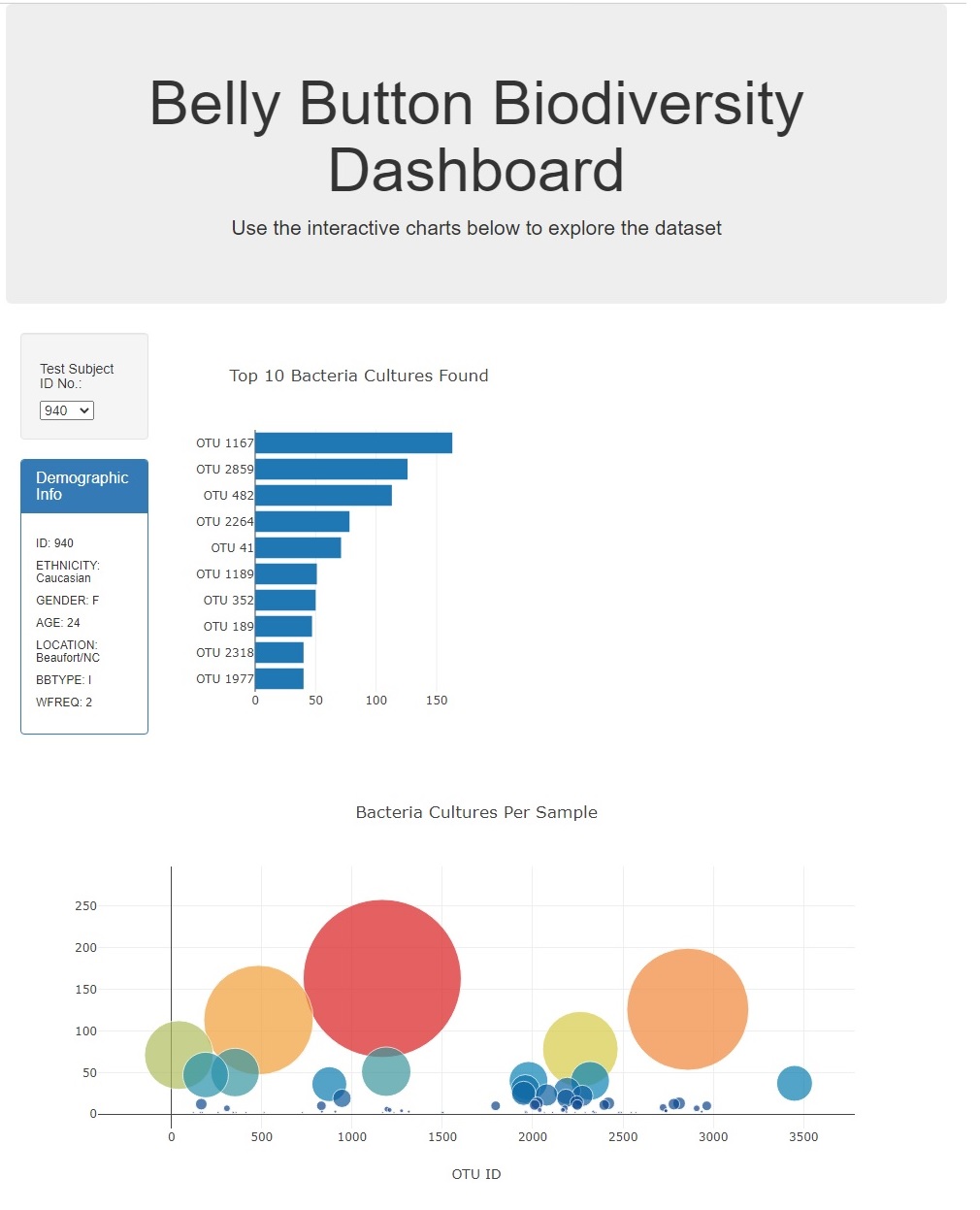
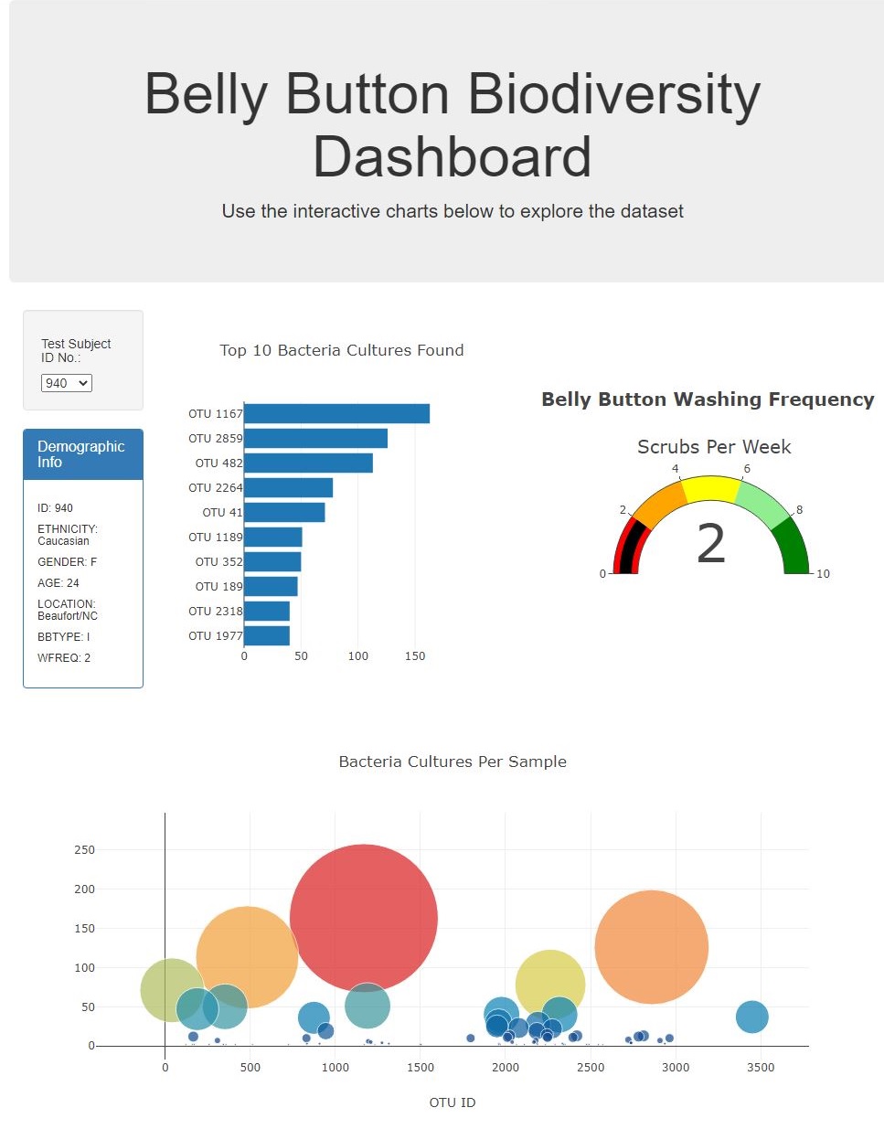
Using your knowledge of JavaScript, Plotly, and D3.js, create a horizontal bar chart to display the top 10 bacterial species (OTUs) when an individual’s ID is selected from the dropdown menu on the webpage. The horizontal bar chart will display the sample_values as the values, the otu_ids as the labels, and the otu_labels as the hover text for the bars on the chart.
Your bar chart should look like the following image:

- Code is written to create the arrays when a sample is selected from the dropdown menu.
- Code is written to create the trace object in the
buildCharts()function, and it contains the following:- The y values are the
otu_idsin descending order. - The x values are the
sample_valuesin descending order - The hover text is the
otu_labelsin descending order.
- The y values are the
- Code is written to create the layout array in the
buildCharts()function that creates a title for the chart. - When the dashboard is first opened in a browser, ID 940’s data should be displayed in the dashboard, and the bar chart has the following:
- The top 10
sample_valuesare sorted in descending order - The top 10
sample_valuesas values - The
otu_idsas the labels
- The top 10
Results with detail analysis:
- Code is written to create the arrays when a sample is selected from the dropdown menu.
Image with
JavaScript&HTMLCode below.
Code and Image
// DELIVERABLE 1: Create a Horizontal Bar Chart

function init() {
  // Grab a reference to the dropdown select element
  var selector = d3.select("#selDataset");

  // Use the list of sample names to populate the select options
  d3.json("JS/data/samples.json").then((data) => {
    var sampleNames = data.names;

    sampleNames.forEach((sample) => {
      selector
        .append("option")
        .text(sample)
        .property("value", sample);
    });

    // Use the first sample from the list to build the initial plots
    var firstSample = sampleNames[0];
    buildCharts(firstSample);
    buildMetadata(firstSample);
  });
}

// Initialize the dashboard
init();

function optionChanged(newSample) {
  // Fetch new data each time a new sample is selected
  buildMetadata(newSample);
  buildCharts(newSample);

}

// Demographics Panel
function buildMetadata(sample) {
  d3.json("JS/data/samples.json").then((data) => {
    var metadata = data.metadata;
    // Filter the data for the object with the desired sample number
    var resultArray = metadata.filter(sampleObj => sampleObj.id == sample);
    var result = resultArray[0];
    // Use d3 to select the panel with id of `#sample-metadata`
    var PANEL = d3.select("#sample-metadata");

    // Use `.html("") to clear any existing metadata
    PANEL.html("");

    // Use `Object.entries` to add each key and value pair to the panel
    // Hint: Inside the loop, you will need to use d3 to append new
    // tags for each key-value in the metadata.
    Object.entries(result).forEach(([key, value]) => {
      PANEL.append("h6").text(`${key.toUpperCase()}: ${value}`);
    });

  });
}

- Code is written to create the trace object in the
buildCharts()function, and it contains the following:- The y values are the
otu_idsin descending order. - The x values are the
sample_valuesin descending order - The hover text is the
otu_labelsin descending order.
- The y values are the
Image with
JavaScript&HTMLCode below.
Code and Image
// 1. Create the buildCharts function.
function buildCharts(sample) {
// 2. Use d3.json to load and retrieve the samples.json file
d3.json("JS/data/samples.json").then((data) => {
// 3. Create a variable that holds the samples array.
var samples = data.samples;
// 4. Create a variable that filters the samples for the object with the desired sample number.
var resultArray = samples.filter(sampleObj => sampleObj.id == sample);
// 5. Create a variable that holds the first sample in the array.
var result = resultArray[0];
// 6. Create variables that hold the otu_ids, otu_labels, and sample_values.
var ids = result.otu_ids;
var labels = result.otu_labels.slice(0, 10).reverse();
var values = result.sample_values.slice(0,10).reverse();
var bubbleLabels = result.otu_labels;
var bubbleValues = result.sample_values;
// 7. Create the yticks for the bar chart.
// Hint: Get the the top 10 otu_ids and map them in descending order
// so the otu_ids with the most bacteria are last.
var yticks = ids.map(sampleObj => "OTU " + sampleObj).slice(0,10).reverse();
console.log(yticks)
// 8. Create the trace for the bar chart.
var barData = [{
x: values,
y: yticks,
type: "bar",
orientation: "h",
text: labels
}];
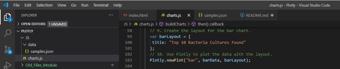
// 9. Create the layout for the bar chart.
var barLayout = {
title: "Top 10 Bacteria Cultures Found"
};
// 10. Use Plotly to plot the data with the layout.
Plotly.newPlot("bar", barData, barLayout);
// 1. Create the trace for the bubble chart.
var bubbleData = [{
x: ids,
y: bubbleValues,
text: bubbleLabels,
mode: "markers",
marker: {
size: bubbleValues,
color: bubbleValues,
colorscale: "Portland"
}
}];

- Code is written to create the layout array in the
buildCharts()function that creates a title for the chart.
Image with
JavaScript&HTMLCode below.
Code and Image
    // 9. Create the layout for the bar chart.
    var barLayout = {
     title: "Top 10 Bacteria Cultures Found"
    };
    // 10. Use Plotly to plot the data with the layout.
    Plotly.newPlot("bar", barData, barLayout);
- When the dashboard is first opened in a browser, ID 940’s data should be displayed in the dashboard, and the bar chart has the following:
- The top 10
sample_valuesare sorted in descending order - The top 10
sample_valuesas values - The
otu_idsas the labels
- The top 10
Image with
JavaScript&HTMLCode below.
Code and Image
// COLUMBIA ENGINEERING
// By Emmanuel Martinez
// Module 12


// DELIVERABLE 1: Create a Horizontal Bar Chart

function init() {
  // Grab a reference to the dropdown select element
  var selector = d3.select("#selDataset");

  // Use the list of sample names to populate the select options
  d3.json("JS/data/samples.json").then((data) => {
    var sampleNames = data.names;

    sampleNames.forEach((sample) => {
      selector
        .append("option")
        .text(sample)
        .property("value", sample);
    });

    // Use the first sample from the list to build the initial plots
    var firstSample = sampleNames[0];
    buildCharts(firstSample);
    buildMetadata(firstSample);
  });
}

// Initialize the dashboard
init();

function optionChanged(newSample) {
  // Fetch new data each time a new sample is selected
  buildMetadata(newSample);
  buildCharts(newSample);

}

// Demographics Panel
function buildMetadata(sample) {
  d3.json("JS/data/samples.json").then((data) => {
    var metadata = data.metadata;
    // Filter the data for the object with the desired sample number
    var resultArray = metadata.filter(sampleObj => sampleObj.id == sample);
    var result = resultArray[0];
    // Use d3 to select the panel with id of `#sample-metadata`
    var PANEL = d3.select("#sample-metadata");

    // Use `.html("") to clear any existing metadata
    PANEL.html("");

    // Use `Object.entries` to add each key and value pair to the panel
    // Hint: Inside the loop, you will need to use d3 to append new
    // tags for each key-value in the metadata.
    Object.entries(result).forEach(([key, value]) => {
      PANEL.append("h6").text(`${key.toUpperCase()}: ${value}`);
    });

  });
}

// 1. Create the buildCharts function.
function buildCharts(sample) {
  // 2. Use d3.json to load and retrieve the samples.json file
  d3.json("JS/data/samples.json").then((data) => {
    // 3. Create a variable that holds the samples array.
    var samples = data.samples;
    // 4. Create a variable that filters the samples for the object with the desired sample number.
    var resultArray = samples.filter(sampleObj => sampleObj.id == sample);
    //  5. Create a variable that holds the first sample in the array.
    var result = resultArray[0];

    // 6. Create variables that hold the otu_ids, otu_labels, and sample_values.
    var  ids = result.otu_ids;
    var labels = result.otu_labels.slice(0, 10).reverse();
    var values = result.sample_values.slice(0,10).reverse();

    var bubbleLabels = result.otu_labels;
    var bubbleValues = result.sample_values;

    // 7. Create the yticks for the bar chart.
    // Hint: Get the the top 10 otu_ids and map them in descending order
    //  so the otu_ids with the most bacteria are last.

    var yticks = ids.map(sampleObj => "OTU " + sampleObj).slice(0,10).reverse();

    console.log(yticks)

    // 8. Create the trace for the bar chart.
    var barData = [{
      x: values,
      y: yticks,
      type: "bar",
      orientation: "h",
      text: labels
    }];
    // 9. Create the layout for the bar chart.
    var barLayout = {
     title: "Top 10 Bacteria Cultures Found"
    };
    // 10. Use Plotly to plot the data with the layout.
    Plotly.newPlot("bar", barData, barLayout);
Deliverable 2:
Create a Bubble Chart
Deliverable Requirements:
Using your knowledge of JavaScript, Plotly, and D3.js, create a bubble chart that will display the following when an individual’s ID is selected from the dropdown menu webpage:
- The
otu_idsas the x-axis values. - The
sample_valuesas the y-axis values. - The
sample_valuesas the marker size. - The
otu_idsas the marker colors. - The
otu_labelsas the hover-text values.
Your bubble chart should look like the following image:

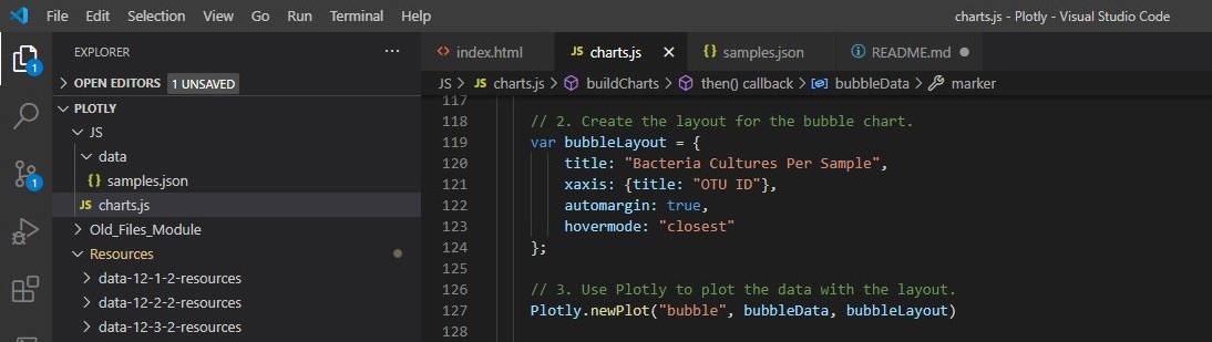
- The code for the trace object in the
buildCharts(); function does the following:- Sets the
otu_idsas the x-axis values - Sets the
sample_valuesas the y-axis values - Sets the
otu_labelsas the hover-text values - Sets the
sample_valuesas the marker size - Sets the
otu_idsas the marker colors
- Sets the
- The code for the layout in the
buildCharts(); function does the following:- Creates a title
- Creates a label for the x-axis
- The text for a bubble is shown when hovered over
- When the dashboard is first opened in a browser, ID 940’s data should be displayed in the dashboard. All three charts should also be working according to their requirements when a sample is selected from the dropdown menu
Results with detail analysis:
- The code for the trace object in the
buildCharts(); function does the following:- Sets the
otu_idsas the x-axis values - Sets the
sample_valuesas the y-axis values - Sets the
otu_labelsas the hover-text values - Sets the
sample_valuesas the marker size - Sets the
otu_idsas the marker colors
- Sets the
Image with
JavaScript&HTMLCode below.
Code and Image
// 1. Create the trace for the bubble chart.
    var bubbleData = [{
      x: ids,
      y: bubbleValues,
      text: bubbleLabels,
      mode: "markers",
       marker: {
         size: bubbleValues,
         color: bubbleValues,
         colorscale: "Portland"
       }
    }];

- The code for the layout in the
buildCharts(); function does the following:- Creates a title
- Creates a label for the x-axis
- The text for a bubble is shown when hovered over.
Image with
JavaScript&HTMLCode below.
Code and Image
// 2. Create the layout for the bubble chart.
    var bubbleLayout = {
        title: "Bacteria Cultures Per Sample",
        xaxis: {title: "OTU ID"},
        automargin: true,
        hovermode: "closest"
    };
- When the dashboard is first opened in a browser, ID 940’s data should be displayed in the dashboard. All three charts should also be working according to their requirements when a sample is selected from the dropdown menu.
Image with
JavaScript&HTMLCode below.
Code and Image
    // 3. Use Plotly to plot the data with the layout.
    Plotly.newPlot("bubble", bubbleData, bubbleLayout)
Deliverable 3:
Create a Gauge Chart
Deliverable Requirements:
Using your knowledge of JavaScript, Plotly, and D3.js, create a gauge chart that displays the weekly washing frequency’s value, and display the value as a measure from 0-10 on the progress bar in the gauge chart when an individual ID is selected from the dropdown menu.
Your gauge chart should look similar to the following image:
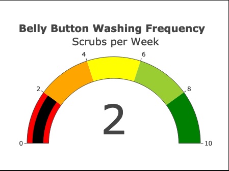
- The code to build the gauge chart does the following:
- Creates a title for the chart.
- Creates the ranges for the gauge in increments of two, with a different color for each increment.
- Adds the washing frequency value on the gauge chart.
- The indicator shows the level for the washing frequency on the gauge.
- The gauge is added to the dashboard.
- The gauge fits in the margin of the
<div>element.
- When the webpage loads, the bar and bubble chart are working according to the requirements in Deliverable 1 and 2, respectively, and the gauge chart is working according to the requirements listed for this Deliverable
Results with detail analysis:
- The code to build the gauge chart does the following:
- Creates a title for the chart.
- Creates the ranges for the gauge in increments of two, with a different color for each increment.
- Adds the washing frequency value on the gauge chart.
- The indicator shows the level for the washing frequency on the gauge.
- The gauge is added to the dashboard.
- The gauge fits in the margin of the
<div>element.
Image with
JavaScript&HTMLCode below.
Code and Image
// 1. Create a variable that filters the metadata array for the object with the desired sample number.
    var metadata = data.metadata;
    var gaugeArray = metadata.filter(metaObj => metaObj.id == sample);

    // 2. Create a variable that holds the first sample in the metadata array.
        var gaugeResult = gaugeArray[0];

    // 3. Create a variable that holds the washing frequency.
    var wfreqs = gaugeResult.wfreq;
    console.log(wfreqs)

    // 4. Create the trace for the gauge chart.
    var gaugeData = [{
      value: wfreqs,
      type: "indicator",
      mode: "gauge+number",
      title: {text: "<b> Belly Button Washing Frequency </b> <br></br> Scrubs Per Week"},
      gauge: {
        axis: {range: [null,10], dtick: "2"},

        bar: {color: "black"},
        steps:[
          {range: [0, 2], color: "red"},
          {range: [2, 4], color: "orange"},
          {range: [4, 6], color: "yellow"},
          {range: [6, 8], color: "lightgreen"},
          {range: [8, 10], color: "green"}
        ],
        dtick: 2
      }
    }];

    // 5. Create the layout for the gauge chart.
    var gaugeLayout = {
     automargin: true
    };

    // 6. Use Plotly to plot the gauge data and layout.
    Plotly.newPlot("gauge", gaugeData, gaugeLayout)
  });
}
HTML Code ````html <div class="col-md-5"> <div id="gauge"></div> </div>
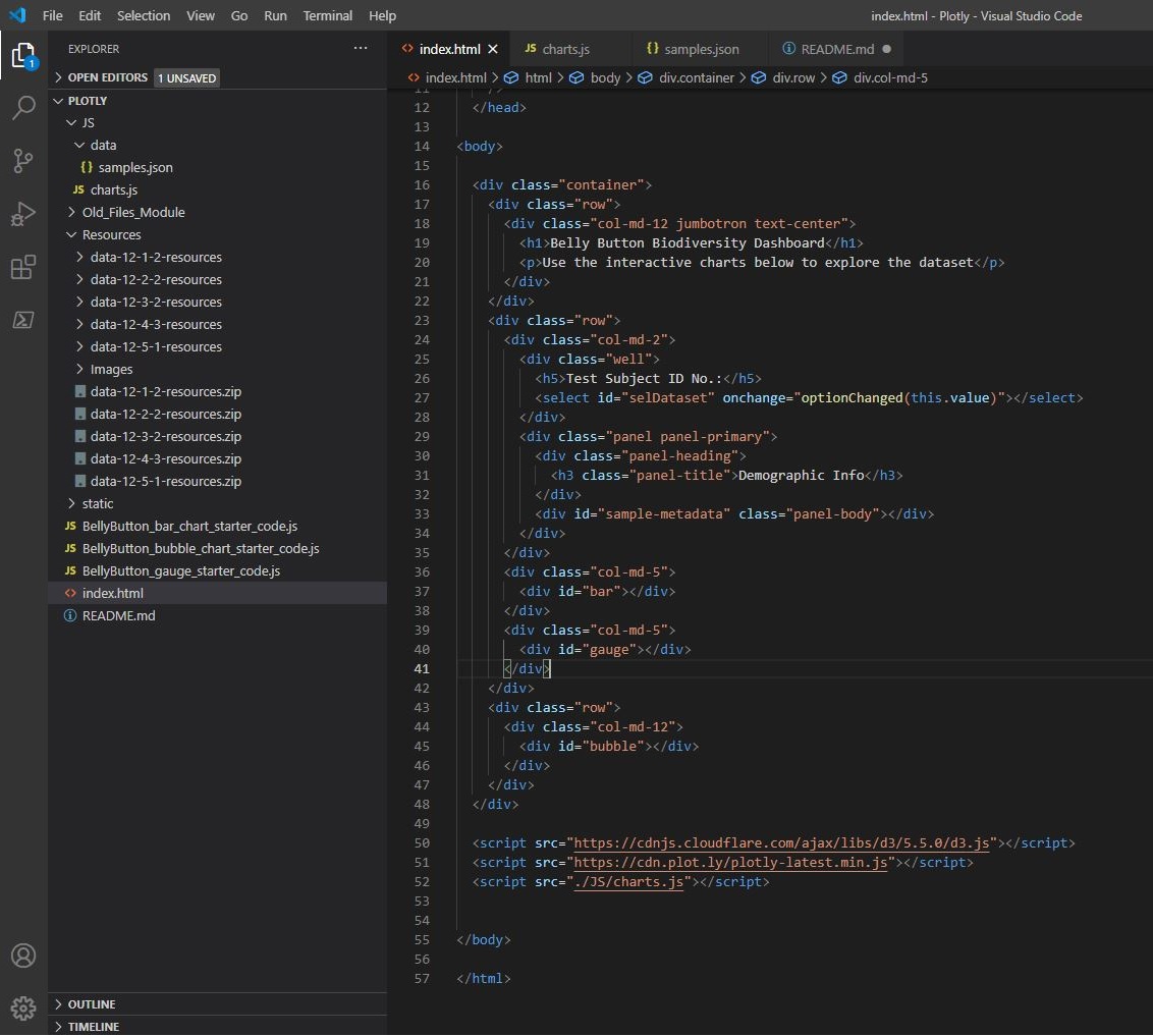
2. **When the webpage loads, the bar and bubble chart are working according to the requirements in Deliverable 1 and 2, respectively, and the gauge chart is working according to the requirements listed for this Deliverable**
> Image with `JavaScript` & `HTML` Code below.
**Code and Image**
````html
<!DOCTYPE html>
<html lang="en">
<head>
<meta charset="UTF-8" />
<meta name="viewport" content="width=device-width, initial-scale=1.0" />
<meta http-equiv="X-UA-Compatible" content="ie=edge" />
<title>Bellybutton Biodiversity</title>
<link
rel="stylesheet"
href="https://maxcdn.bootstrapcdn.com/bootstrap/3.3.7/css/bootstrap.min.css"
/>
</head>
<body>
<div class="container">
<div class="row">
<div class="col-md-12 jumbotron text-center">
<h1>Belly Button Biodiversity Dashboard</h1>
<p>Use the interactive charts below to explore the dataset</p>
</div>
</div>
<div class="row">
<div class="col-md-2">
<div class="well">
<h5>Test Subject ID No.:</h5>
<select id="selDataset" onchange="optionChanged(this.value)"></select>
</div>
<div class="panel panel-primary">
<div class="panel-heading">
<h3 class="panel-title">Demographic Info</h3>
</div>
<div id="sample-metadata" class="panel-body"></div>
</div>
</div>
<div class="col-md-5">
<div id="bar"></div>
</div>
<div class="col-md-5">
<div id="gauge"></div>
</div>
</div>
<div class="row">
<div class="col-md-12">
<div id="bubble"></div>
</div>
</div>
</div>
<script src="https://cdnjs.cloudflare.com/ajax/libs/d3/5.5.0/d3.js"></script>
<script src="https://cdn.plot.ly/plotly-latest.min.js"></script>
<script src="./JS/charts.js"></script>
</body>
</html>
Deliverable 4:
Customize the Dashboard
Deliverable Requirements:
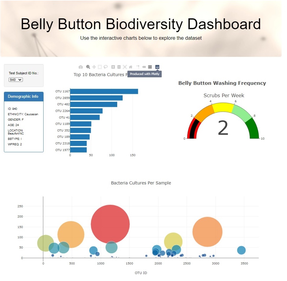
Use your knowledge of HTML and Bootstrap to customize the webpage for your dashboard.
- Customize your dashboard with three of the following:
- Add an image to the jumbotron.
- Add background color or a variety of compatible colors to the webpage.
- Use a custom font with contrast for the colors.
- Add more information about the project as a paragraph on the page.
- Add information about what each graph visualizes, either under or next to each graph.
- Make the webpage mobile-responsive.
- Change the layout of the page.
- Add a navigation bar that allows you to select the bar or bubble chart on the page.
- When the dashboard is first opened in a browser, ID 940’s data should be displayed in the dashboard, and the three charts should be working according to their requirements.
- When a sample is selected, the dashboard should display the data in the panel and all three charts according to their requirements.
Results with detail analysis:
- Customize your dashboard with three of the following:
- Add an image to the jumbotron.
- Add background color or a variety of compatible colors to the webpage.
- Use a custom font with contrast for the colors.
- Add more information about the project as a paragraph on the page.
- Add information about what each graph visualizes, either under or next to each graph.
- Make the webpage mobile-responsive.
- Change the layout of the page.
- Add a navigation bar that allows you to select the bar or bubble chart on the page.
Image with
JavaScript&HTMLCode below.
Code and Image
body {

    color: #000000;
    background-color: rgb(255, 255, 255);
  }

 .tag {
     font-family: inherit;
     font-size: 1rem;
    }

.jumbotron {
    background-image: url("../images/bacteria.jpg");
    background-size: 100% 100%;
    text-align: center;
  }
- When the dashboard is first opened in a browser, ID 940’s data should be displayed in the dashboard, and the three charts should be working according to their requirements.
- When a sample is selected, the dashboard should display the data in the panel and all three charts according to their requirements.
Page Not Responsive